Role: Illustration • UI • UX • Branding
Platform: Mobile
Preloaded is a client-led game studio, with focus on developing AR and geospacial mobile games.
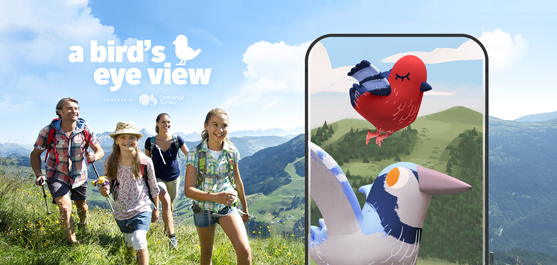
I was lead artist on "a bird's eye view", a geospatial mobile game produced by Preloaded for Ordnance Survey. As part of a small team, in tandem with the client, we sought to create a game which would get families outdoors more often, and exploring more diverse locations.
As lead artist, I produced work for all aspects of the visual design. From developing the IP, producing concept art, adverts and animation, all the way through to delivering Unity-ready UI and UX assets. I also provided direction and resources for a small team of 3D and technical artists.
IP Development
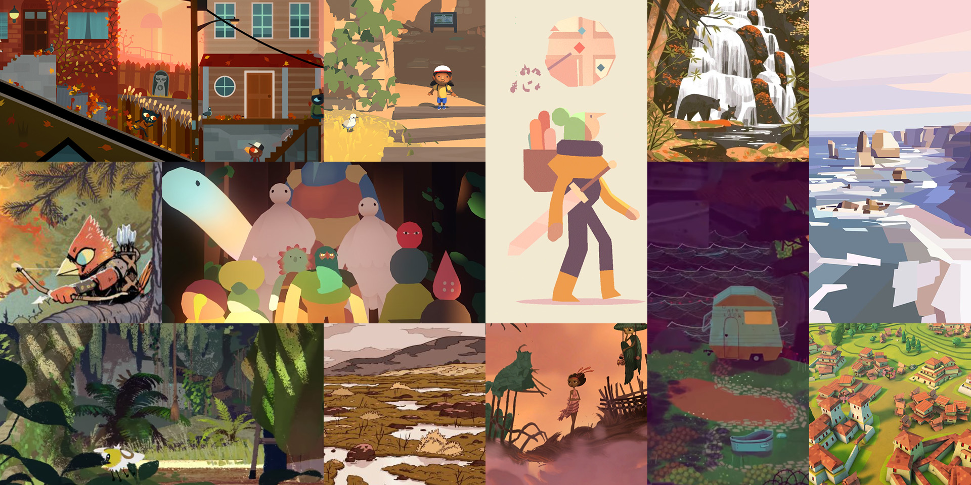
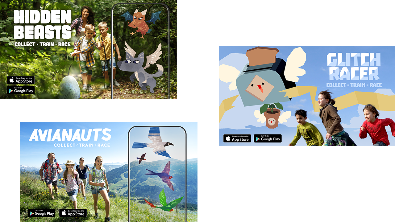
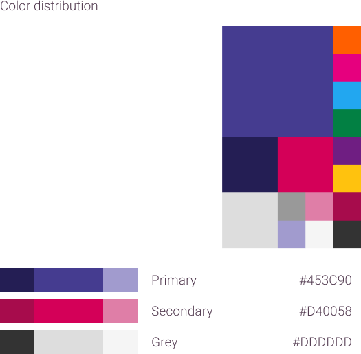
In order to develop the IP for Ordnance Survey's first venture into the gaming sector, I first conducted market research, identifying the competition and considering marketing fit, for both style and content. The challenge was determining which visual direction would maximize flexibility for the brand, while also feeling like a part of Ordnance Survey's existing product catalogue.
Refining the IP direction involved running workshops with the newly established gaming production arm of Ordnance Survey, using mood boards and feedback forms to survey the target user group, and producing adverts for Facebook to gauge click-through interest.

Concept Design
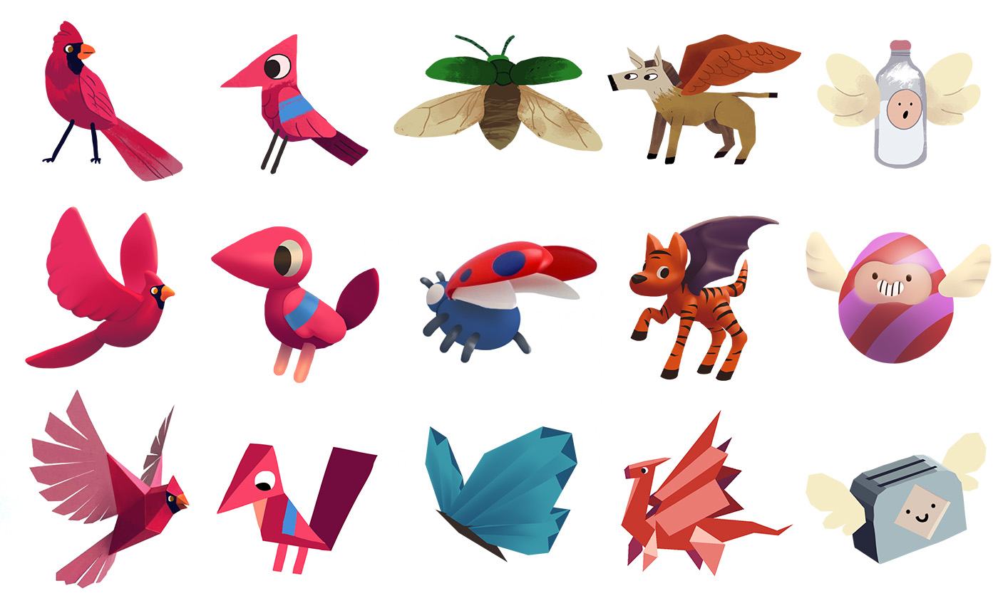
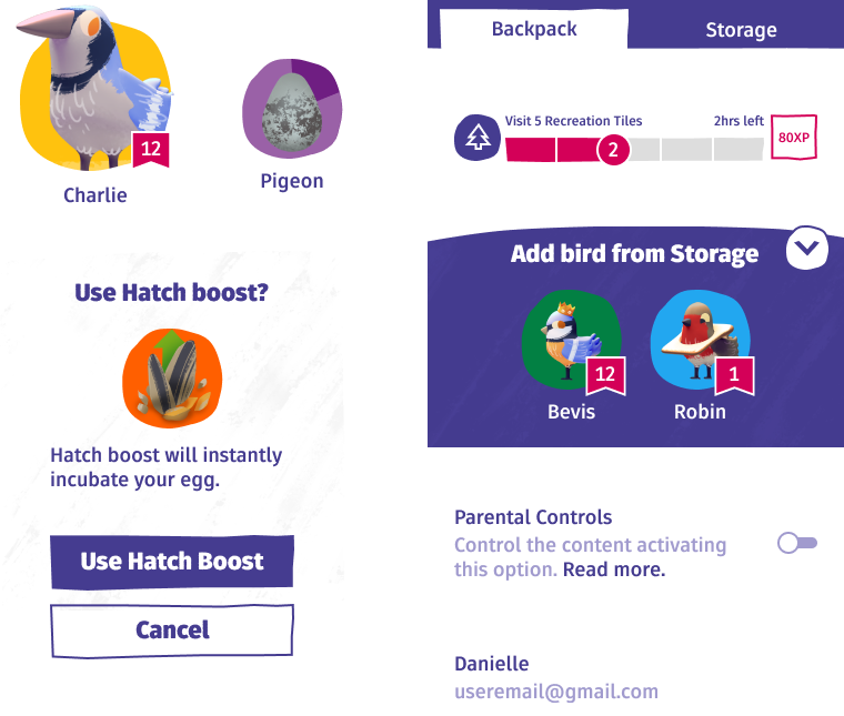
Game design had settled upon a exploration game with competitive elements; the player would travel to unexplored locations in the real world, in order to train a creature to race against other players' creatures.
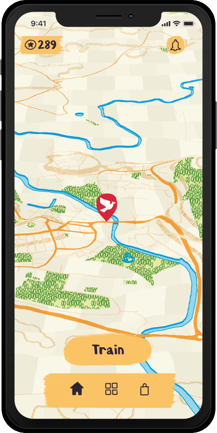
To describe the players' exploration, as they travel, new parts of the map are revealed. The visuals in undiscovered areas are inspired by Ordnance Survey maps, using symbols and colours inherited from their brand and products. Once discovered, maps sections would fill in with earthy colours, sprites and effects, in order to suggest that the world is richer for the player having explored it.
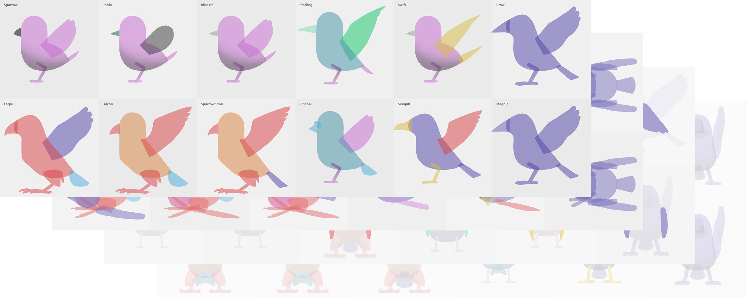
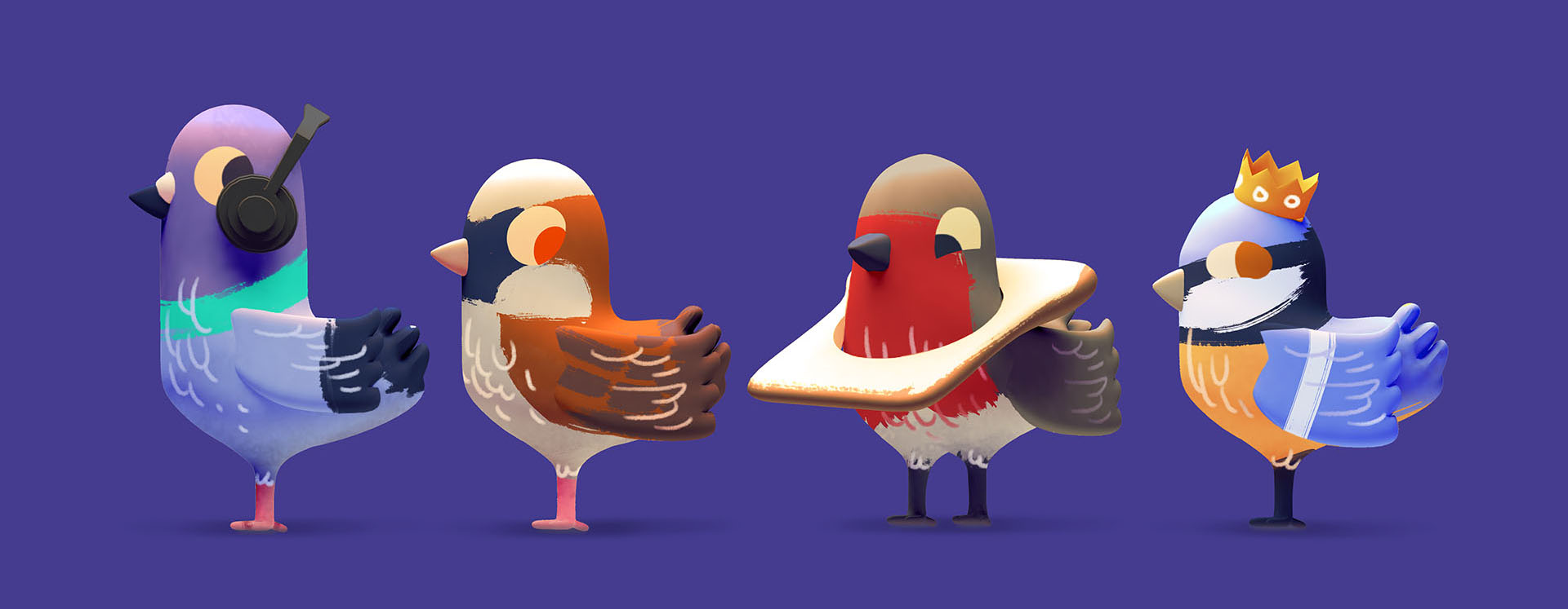
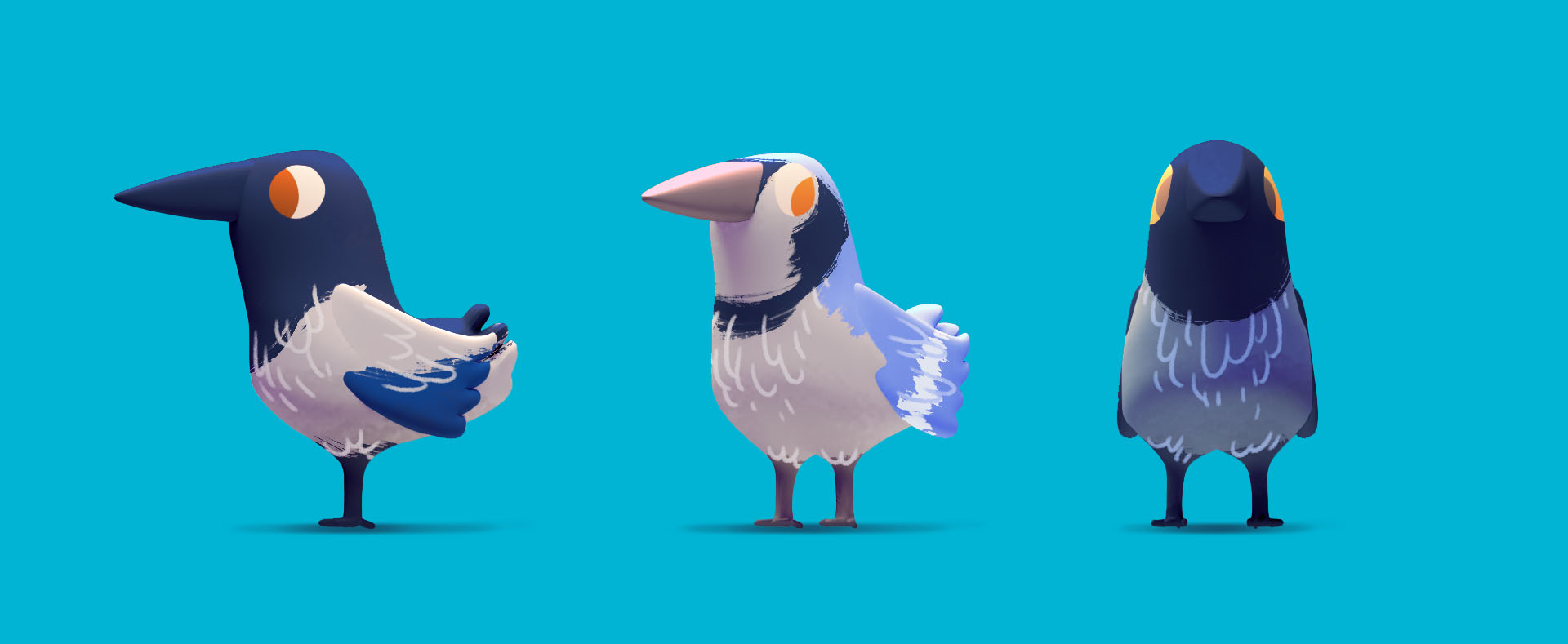
Aligning with the perspective a player has of the map, and Ordnance Survey's brand goals, we settled upon birds as the player companion. Combining a tactile rendering with 3D models, we could capture a simple approachable cartoony feel, with a warm sketchy indie appeal.
I designed the birds to be modular, allowing economic generation of more characters for future releases and expansions.
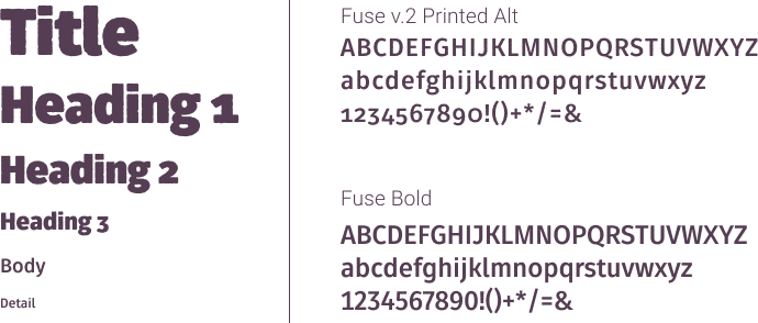
Branding and UI
As this game is Ordnance Survey's first venture into the gaming sector, the brand too, needed to feel like a natural extension of their product library.
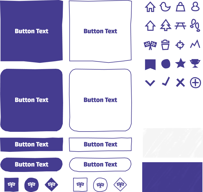
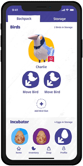
UX
Leaning into existing well known patterns, I developed the visual language and interaction patterns with a focus on modularity and usability. In order to assist the player in navigating the app, I ensured the transition animation was as content-descriptive as possible, and the content itself was displayed in a consistent format.