Role: UI • UX
Platform: Android • IOS
Players will undertake epic quests, fight fearsome foes, and test their mettle against the looming darkness of the tower.
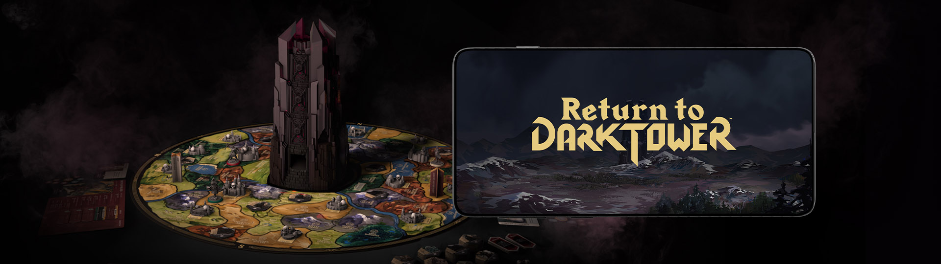
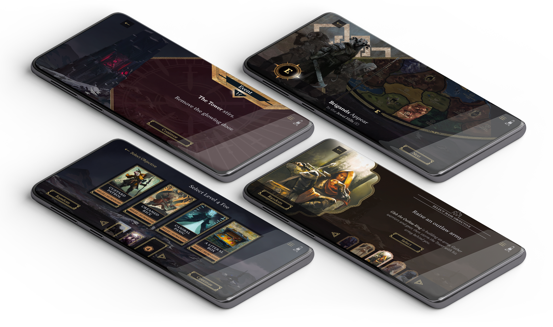
Return to Dark Tower is the spiritual successor to the 80s cult board game Dark Tower, one of the first board games to contain digital components. My role in the team was to design the companion app, which functions as the antagonist of the game, spawning foes and challenges onto the board for the players to overcome.
Visual Language
As the project included existing physical components, first I translated the current paper designs for use in digital applications. Using the physical designs as a springboard, I expanded upon the design language, developing the UI themes and design of the interactive elements.
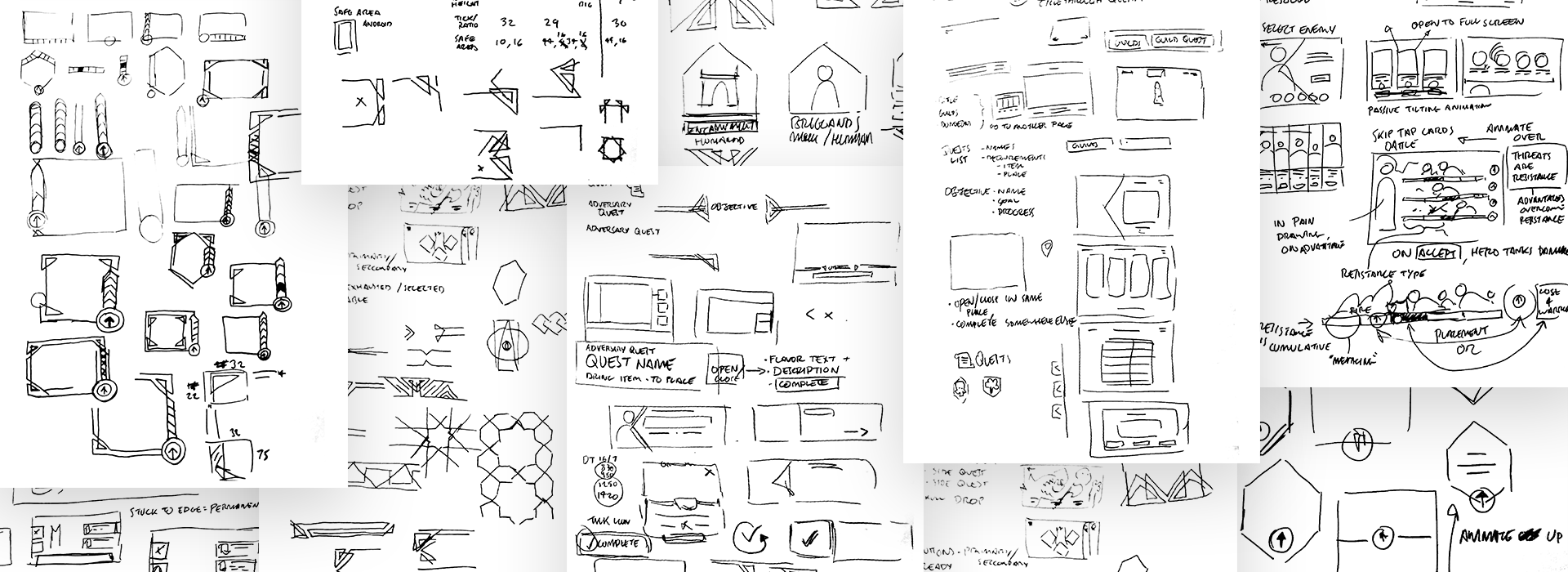
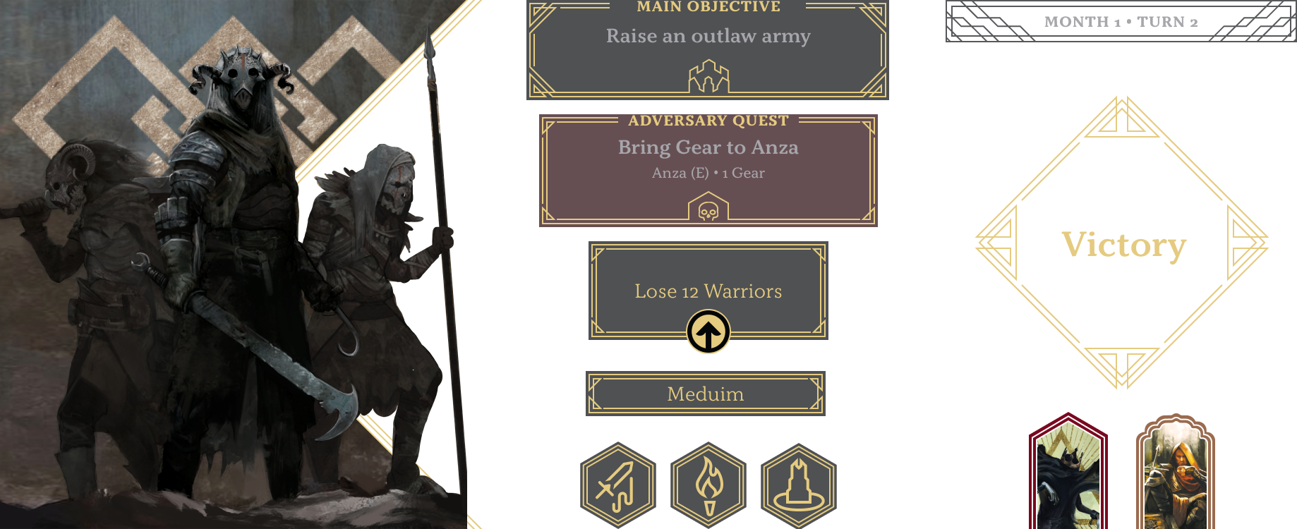
Initial wireframes
Through researching the current state of boardgame companion apps, by looking into reviews and critiques of existing games, and playing many, I identified key design elements to include in the designs and potential pitfalls to avoid.
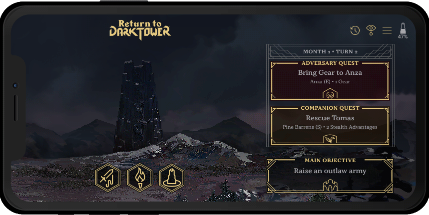
Early prototypes helped define the content for the app. From there, I designed components which could be used as flexibly as possible, and presented them in a way that teaches the player how to interact with the app. I made sure interaction methods and the visual design catered to a range of accessibility needs, with flexibility for further customization.
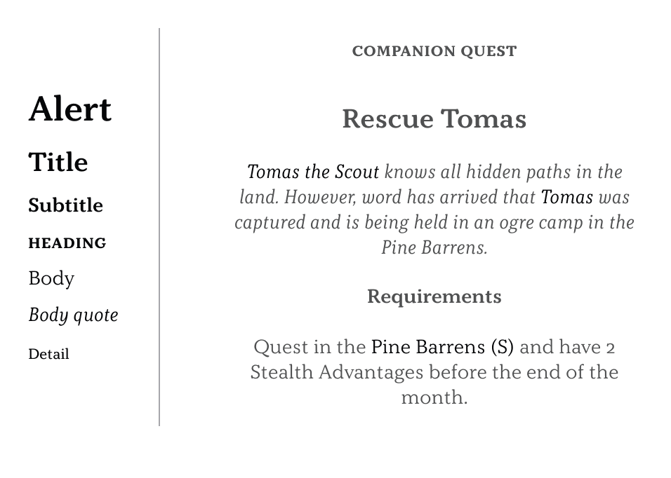
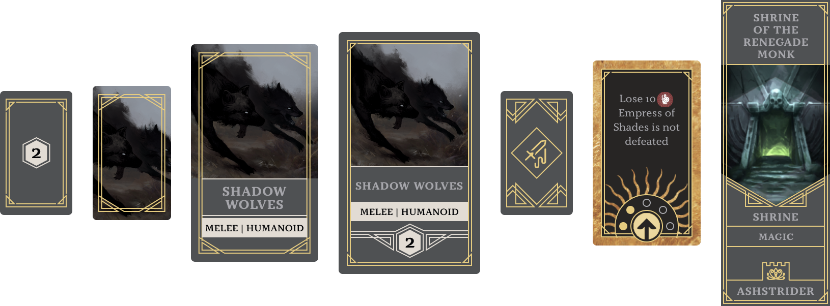
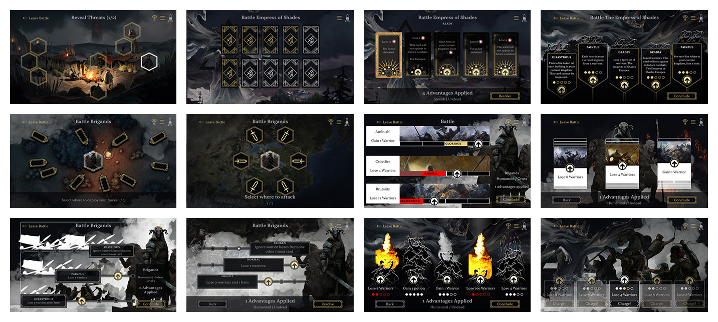
Battle Concepts
One of the main challenges faced was how to represent a battle between the player and a foe in the app, it turned out to be quite a balancing act.
Battles needed to be a quick as possible, as they happen many times in a game and could greatly affect play time. However, they also needed to feel like significant events, they couldn't be too exciting and draw attention from the board, while not too dull as to feel redundant.
We spent a long time ideating, testing and iterating until we came to a design which most fittingly satisfied the design constraints.
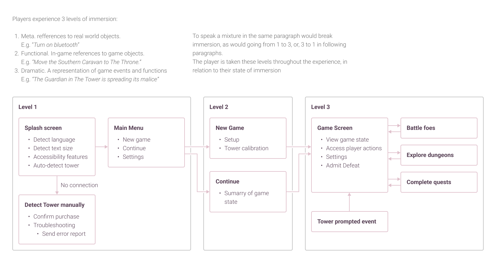
Animation
The wireframes included transition animation to help the player understand their location in the app hierarchy, and elements provide feedback to show recognition of input. Background animation is added for extra texture.